REBECCA TORVIK

UX/UI Bootcamp
The George Washington University
Website Design & Coding
Case Study:
Toronto Cupcake
Project Overview
Team
Rebecca, Sam, Kaitlyn, Melissa
Duration
4 weeks design (2020)
Tools Used
Figma, VSCode, Github, Miro
THE ASSIGNMENT
We were tasked with utilizing the UX/UI design process to redesign and code a front-end web prototype. We chose to redesign a website for a small business called Toronto Cupcake.
THE PROBLEM
Toronto Cupcake's website is causing users to second guess the professionalism and quality of the cupcakes they provide.
THE SOLUTION
By designing a website with strong visuals, a clear brand identity, and intuitive information architecture, we provided users with an experience that allows them to easily view and purchase cupcakes while increasing their overall experience with the Toronto Cupcake website.
Our Roles
While many aspects of the design process were highly collaborative, I took the lead in designing the user interface, organizing the information architecture, and delegating group responsibilities. I developed a Gantt Chart to aid the task division, maintain organization, and ensure deadline success. Highlighted in the Gantt Chart below are all the tasks I was directly involved in.

The Process
Research
Definition
Ideation
Prototyping
& Testing
Coding
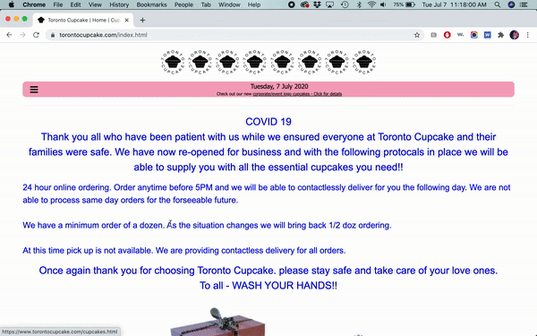
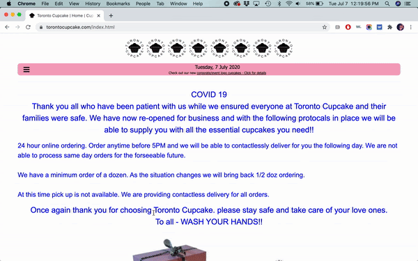
Current Site
Heuristic Evaluation
AESTHETICS / APPEARANCE
-
Inconsistent designs
-
Poor contrast and use of white space
-
Most images are extremely grainy and have very poor/inconsistent lighting
-
Often poor contrast and text is difficult to read
-
Not enough difference between header text
CONTENT
-
Content appears unbalanced with the abundance of white space in footer
-
Content is outdated on multiple pages
-
Titles are often unclear
NAVIGATION
-
Hamburger menu makes for inefficient customer experience as users need to continuously use the icon to navigate between sites
-
“Connect” instead of “Contact” is confusing
-
“View cart” does not stand out
-
Can't click on the logo to go back to homepage
EFFICIENCY / FUNCTIONALITY
-
Poor link etiquette
-
Cart is on a separate page and will take you there every time you add an item
Cultural Differences
To better understand the market and users of Toronto Cupcake, we researched cultural differences between the United States and Canada. We analyzed variations in topics such as currency, language, communication, values, and eCommerce.


User-Persona

Research Plan for Original Site
We hypothesized that the UI on the Toronto Cupcakes site needed to be addressed.
GOAL / OBJECTIVE
-
Understand user pain points when navigating the site
-
Identify what users expect to see when visiting a cupcake bakery website
5
Usability Tests
20
Survey Responses
Stakeholder Interview
Usability Test Feedback
DESIGN IMPRESSIONS
-
“Text is too small”
-
“Why so much white space?”
-
“Where are the cupcakes?”
-
“I don’t like the product images”
BRAND IMPRESSIONS
-
“..must be a small business”
-
“I’d be hesitant to order”
-
“Looks very amateurish”
-
“That’s all there is?”

KEY TAKEAWAYS
Information architecture needs work (especially Navigation menu)
Find a solution for lower quality cupcake images used
Brand identity improvement needed with a clean, clear user interface and a professional appearance
Survey Feedback
20 Participants
18-45 years old
70% had never ordered a cupcake/dessert online, but 50% were open to doing so
50% would use the site to see the cupcake selection prior to visiting the shop
50% would use the site to order for pick up or delivery
60% of people prefer buying a variety of cupcake flavors in an order
Stakeholder Interview
Interview with Michael Mancuso,
Head Web Designer for Toronto Cupcake
-
All orders are taken through the website
-
No storefront, but in the process of creating one
-
Outdated SEO practices
-
Rely on word of mouth for marketing
Outdated Designs (lack of meta tag)
Research
Understanding Users and the Problem
USER INSIGHT
The site currently fails to grab the attention of users in an effective way fostering an eCommerce process that is redundant and tiring.
"HOW MIGHT WE" STATEMENT
How might we improve the visual aesthetic and shopping experience on the Toronto Cupcake website so that the users are able to successfully order cupcakes in an easy and intuitive way?
USER EXPECTATIONS
-
A clean and intuitive interface
-
Easy to locate contact, delivery or pick-up information
-
Reviews & recommendations
-
High-quality visuals of the cupcakes available for purchase
Value Proposition
Information Architecture
Prioritize the cupcake ordering process, make contact and delivery Information more prominent, and revamp navigation menu
Brand Identity
Update visuals and typography to provide the company with a distinct and professional image
ECommerce
Redesign the shopping cart and product page to make a more cupcake ordering process more intiutive
Definition
Feature Prioritization Matrix
We used a feature prioritization matrix to compare the goals and needs of the users and the business. This helped us evaluate which features to focus on based on their importance to both parties. We made an effort to prioritize creating the following:
-
Clear shopping cart
-
Well organized content
-
Clean and clear interface
-
High-quality visuals
-
Easy access to contact and location info
-
Reviews & recommendations

Storyboard

Ideation
LoFi Prototypes


HiFi Prototypes & Guerrilla Tests
We tested our high fidelity prototype with the goal of measuring its intuitiveness.
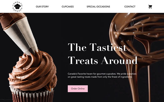
The original site’s homepage is very sparse and mainly consists of Covid information in painful blue text. In redesign one, we tried to fix this issue by having the Covid info in a pink banner on the hero image as well as in another section on the homepage. However, we learned through guerrilla testing that users found this unreadable and difficult to find. Our second redesign solves the issue by placing the information clearly and directly under the hero image.
Additionally, our usability test revealed the importance of having delivery information on the homepage, which we added to our second redesign.
The original contact page, called “connect” lacks substance. Toronto Cupcake has the unique situation of being delivered-only with a store coming soon. This is not clear on the original homepage and users still did not understand this in our first redesign. Our second redesign aims to make this fact more prominent by attaching it to deliver information that we learned that users also expected to see on the contact page.


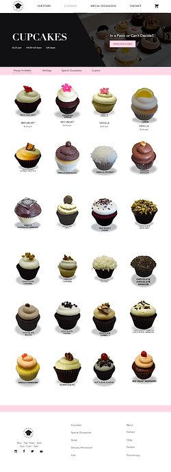
In our guerilla test, we asked users to add 6 red velvet cupcakes to their cart. Users did not have any comments on the product page. However, in the popup of the product, users were clicking on the "18.50 half dozen price". This was not originally a button, but we decided to make it one due to this behavior.


Our initial research identified that users are frustrated by Toronto Cupcake's shopping cart. The cart is difficult to find in the collapsed hamburger menu and tedious to use as a separate page that automatically navigates users when an item is added to the cart. These pain points drove the redesign's creation of the shopping cart icon in a static header that functions as a dropdown menu when clicked.
Another change to the shopping cart was the addition of the randomize dozen button. This is an existing feature on Toronto Cupcake's product page that adds twelve random cupcakes to the cart. Our redesign includes it on both the product page and the shopping cart. The decision was fostered by a competitive analysis where we observed Krispy Creme's inclusion of this button on the user's shopping cart.


We were not able to test the Our Story page. However, an important change we added is combining the original site’s About page and Community page because separately, the pages lacked substance.


We also combined the sparse Occasions page and Corporate Events page into the Special Occasions page for a more complete and elegant design.


HOMEPAGE
CONTACT PAGE
CUPCAKE PAGE
SHOPPING CART
OUR STORY PAGE
SPECIAL OCCASIONS PAGE
Prototyping & Testing
Final Thoughts
Challenges
-
Coding was a challenge since we are primarily designers
-
Finding high-quality photos taken by Toronto Cupcake
Next Steps
-
Finish Coding
-
Get professional photos to replace stock images
-
Design and code responsive versions
-
Add testimonials and customer reviews
Other Work


